Getting Started With Headless Browser Testing

[Guest Blog by Uzi Eilon, CTO, Perfecto]

The “shift left” trend is actually happening, developers as part of the DevOps pipeline need to test more and add more automation testing in order to release faster.

In addition, those tests are almost the last barrier before production, because the traditional testing is going away.

In such case, the standard unit tests are not good enough, and the E2E tests are complicated and require a longer time of setup and prepare.

This is the reason both Google and Mozilla released new JS headless browsers to help their developers to execute automation tests.

The same happened in the mobile area where Apple and Google released the XCUItest and Espresso.

Headless browsers provide the following capabilities in order for the developers to use it:

  • Same language , same IDE , same working environment:
    Most of the web develops work with  JS so these browsers are JS platform , to add new test you should open new class and write standard JS code.
  • FAST Feedback & Execution
    These tests need to be executed fast (sometime every commit) , these browser reduce the UI and rendering “noise” connect to the element directly  and run very fase.
  • Easy to setup
    Developers time is expensive, and developers will not add complicated processes for test , the setup of the tools is a simple npm installation.
  • Access to all the DevTools capabilities
    Developers need more details , these tools give access to all the DevTools data includes accessibility, network, log , security and more.
    Smart tests can be very powerful and cover not only the functionally but also the efficiency

In order to understand more I played with Puppeteer and I’m happy share my thoughts with you.

Installation

Very simple

npm i –save puppeteer

Documentation

Not a lot of examples or discussions about specific issues but I did find the API documentation that contains everything I was looking for.

Objects identification

Intuitive – Same way I connected to my object via any JS  .

Example:

  • by id : page.type(‘#firstName’,‘Uzi’);·
  • by class page.type(‘.class,‘Uzi’);

Sync and waiting for elements

In this case, I have to admit I struggled with the standard wait for navigation command, it was not stable:

await page.waitForNavigation({waitUntil:‘load’})

at the end I used the following :

await page.waitForSelector(‘#firstName’,{visible:true}).then(()=>
{      // do the actions per page
page.screenshot({path: ‘then.png’,fullPage: false})
});


UI

As part of my test I tried to verify the screen by taking a screenshot, I liked the way I could change the browser UI capabilities and configure my page:

const fullScreen = {
deviceScaleFactor: 1,
hasTouch: false,
height:  2400 ,
isLandscape: false,
isMobile: false,
width: 1800,
fullPage: true
};
page.setViewport(fullScreen)


Other devOpts options:

it is very easy to use, for example I would like to see all my links in a frame

for (let child of frame.childFrames())
{
dumpFrameTree(child, indent + ‘  ‘);
}


Summary:

Using the headless browser like Puppeteer was very easy and intuitive, it felt natural to add it as part of my testing code.

In addition, setting up the headless browser environment and executing was very simple and fast.

On the less convenient point, what I found was that to get the results directly into the CI, one should add more scripting code or use other executions methods.

Lastly, this method still ramps up, hence has some small bugs in few features and also lacks documentation and more samples, however, for an early testing tool for white-box/unit testing, it is very promising and well-positioned to complement tools such as Selenium. AS a matter of fact, what I also saw, is that other browser vendors are taking the same approach and investing in headless browsers – Mozilla, Microsoft.


P.S: If you want to learn more about the growing technologies and trends in the market, I encourage you to follow My podcast with Uzi Eilon called Testium (Episode 6 is fully dedicated to this subject)

The Rise of Progressive Web Apps and The Impact on Cross-Browser Testing

If we all thought we’ve figured out the digital market from an application type perspective, and have seen the rise of mobile, and the transformation of web to responsive web – now we should all start getting used to a whole new type of application that should change the entire user experience and offer new web functionality – Meet PWA’s.

Google.com is a very clear example of such app, and Apple is about to introduce PWA capabilities in its upcoming WebKit engine.

What are Progressive Web Apps?

If to refer to Google official website dedicated to PWA, Google defines PWA as “A new way to deliver amazing user experiences on the web

David Rubinstein from SD Time, actually add even more insights into these new app types:

PWAs can use device features like cameras, data storage, GPS and motion sensors, face detection, Push notifications, and more. This will pave the way for AR and VR experiences, right on the web. Imagine being able to redecorate your home virtually using nothing but your phone and a PWA. Pan your camera around a room, then use tools on a website to change wall colors, try out furniture, hang new artwork, and more. It may feel like a futuristic fantasy, but it’s close to reality.

The key behind PWA apps is to provide a rich end-user alternative to native apps. These apps can be launched from the device home screen adding layers of performance, reliability, and functionality to a web application without the need to install anything from the app store. In addition, these apps that are still JavaScript based, but with additional specific API’s can work even when there’s no internet connection and that’s  a huge advantage.

PWA apps leverage 2 main architectural features:

  • Service Workers – give developers the ability to manually manage the caching of assets and control the experience when there is no network connectivity.
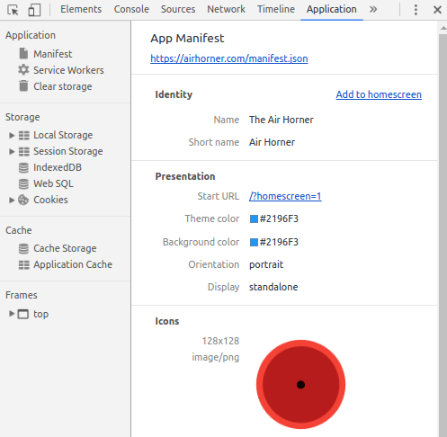
  • Web App Manifest – That’s the file within the PWA that describe the app, provide metadata specific to the app like icons, splash screens and more. See below an example Google offers for such a descriptor file (Json)
{
  "short_name": "AirHorner",
  "name": "Kinlan's AirHorner of Infamy",
  "icons": [
    {
      "src": "launcher-icon-1x.png",
      "type": "image/png",
      "sizes": "48x48"
    },
    {
      "src": "launcher-icon-2x.png",
      "type": "image/png",
      "sizes": "96x96"
    },
    {
      "src": "launcher-icon-4x.png",
      "type": "image/png",
      "sizes": "192x192"
    }
  ],
  "start_url": "index.html?launcher=true"
}


In order to check the correctness of your PWA checklist and the entire app, Google offers some tools as part of their documentation like this Progressive Web Apps checklist, and their chrome built-in DevTools (see below visual),

As deeply covered in this great Dzone article, good PWAs also implement the PRPL pattern recommended by Google to enhance performance.

What Are the Implications of PWAs for Cross-Browser sites and Mobile Apps?

To understand the implications, I recommend dividing the question into the impacted Personas.

  1. Developers
  2. Testers
  3. Business
  4. End-Users

Each of the above Personas will have different benefits and implications when adopting this kind of apps.

Developers

For existing web developers, this new app type should present a whole new world of innovative opportunities. Since PWAs are still JavaScript based apps, developers do not need to gain new skills, but rather learn the new APIs offered through the Service Workers and see how they can be leveraged by their websites.  Since the PWA app runs on a mobile device and can be launched without a network connection and without any installation, obviously it needs to be validated by developers through unit and integration tests.

Going forward, the market envisions these apps impacting the native apps architecture in a way that there will only be 1 type of app that can seamlessly run on both browsers and mobile devices with one single implementation – that will require a heavier lift and re-work.


Testers

For testers, as in every new implementation, new tests (manual, automated) needs to be developed, executed and fit into the overall pipeline.

PWAs, in particular, introduces some unique use cases such as

  • No network operation
  • High performance 
  • Sensors based functionality (Location, Camera for AR/VR and more)
  • Cross-device functionality (like in Responsive, the experience should be the same regardless of the screen size/HW etc.)
  • Adhering to the design and checklist required by Google and soon Apple
  • Accessibility is always a need
  • Security of these apps (with and without being connected to the network)

Business

For the business, the new app types shall help increase the end-user engagement with the business. When having a web application that is richer in functionality, performs fast, and can be “always on” through an easy launch from the customers’ device home screen, this by definition should increase usage and move the needle to the business. My assumption is that large enterprises are already looking into these type of apps as the next-gen RWD apps.

End Users

At the end of the day, all products are aiming to get greater engagements with the customers and beat the competition. Obviously, if the end users will understand the value in these apps, and can “feel” it in their day by day activities, this will be a clear Win-Win situation to both the organization as well as the customer.

To assure end-user experience as Google envisioned when first launching this technology 3 years ago (2015), Dev and Test teams should continue their continuous testing activities, and make sure they are covering sufficient platform, features and use cases between each release and each new release of a platform or device.

To conclude this blog, I highly recommend watching the short video and read the blog from Mozilla on how PWA live within Firefox and how different experience users get from such apps (see below Firefox Wego app within Firefox browser in the background and a PWA Wego app in the foreground)

Happy PWA Testing!

Continuous Testing Principles for Cross Browser Testing and Mobile Apps

Majority of organizations are already deep into Agile practices with a goal to be DevOps and continuous delivery (CD) compliant.

While some may say that maximum % of test automation would bring these organizations toward DevOps, It takes more than just test automation.

To mature DevOps practices, a continuous testing approach needs to be in place, and it is more than automating functional and non-functional testing. Test automation is obviously a key enabler to be agile, release software faster and address market events, however, continuous testing (CT) requires some additional considerations.

Tricentis defines CT accordingly:

CT is the process of executing automated tests as part of the software delivery pipeline in order to obtain feedback on the business risks associated with a software release candidate as rapidly as possible. It evolves and extends test automation to address the increased complexity and pace of modern application development and delivery

The above suggests that a CT process would include a high degree of test automation, with a risk-based approach and a fast feedback loop back to developer upon each product iteration.

How to Implement  CT?

  • A risk-based approach means sufficient coverage of the right platforms (Browsers and Mobile devices) – such platform coverage eliminates business risks and assures high user-experience. Such platform coverage is continuous maintenance requirements as the market changes.
  • Continuous Testing needs an automated end-to-end testing that integrates existing development processes while excluding errors and enabling continuity throughout SDLC. That principle can be broken accordingly:
    • Implement the “right” tests and shift them into the build process, to be executed upon each code commit. Only reliable, stable, and high-value tests would qualify to enter this CT test bucket.
    • Assure the CT test bucket runs within only 1 CI –> In CT, there is no room for multiple CI channels.
    • Leverage reporting and analytics dashboards to reach “smart” testing decisions and actionable feedback, that support a continuous testing workflow. As the product matures, tests need maintenance, and some may be retired and replaced with newer ones.
  • Stable Lab and test environment is a key to ongoing CT processes. The lab should be at the heart of your CT, and should support the above platform coverage requirements, as well as the CT test suite with the test frameworks that were used to develop these tests.
  • Utilize if possible artificial intelligence (AI) and machine learning (ML)/deep-learning (DL) solutions to better optimize your CT test suite and shorten the overall release activities.

  • Continuous Testing is seamlessly integrated into the software delivery pipeline and DevOps toolchain – as mentioned above, regardless of the test framework, IDEs and environments (front-end, back-end, etc.) used within the DevOps pipeline, CT should pick up all relevant testing (Unit, Functional, Regression, Performance, Monitoring, Accessibility and more), execute them in parallel and in an unattended fashion, to provide a “single voice” for a Go/No-Go release – that happens every 2-3 weeks.

Lastly, for a CT practice to work time after time, the above principles needs to be continuously optimized, maintained and adjusted as things change either within the product roadmap or in the market.

Happy CT!

Complementing Cross-Browser Testing with Headless Unit Testing Solutions

Nothing new in the land of cross-browser testing. Selenium as the underlying API layer serves leading frameworks including WebDriverIO, Protractor (Angular based testing), NightWatchJS, RobotJS and many others.

For web application developers that require fast feedback capabilities post their code commit or bug resolution, there are various testing options. Some would quickly test manually on a set of local or cloud based VM’s, some will develop unit tests (qUnit etc.), but there are also very mature cross browser testing solutions that add more layers of coverage and insights in an automated and easy way.

In a recent eBook that I developed, I’m covering the 10 emerging cross-browser testing tools with a set of considerations around how to choose the right one or the right mix of them.

As can be seen in the 10 tools shown above, there is a mix of a unit as well as E2E functional testing tools mostly javascript based.

Developers who would like to include as part of their quick sanity post commit a validation of the load time it takes the site to load, can easily add this PhantomJS based test into their CI post build acceptance testing and get such visibility after each successful build – that, match the result with a benchmark and take decisions.

In a quick test that I ran on the NFL.com website, I was able to not only detect a slow load of 10sec. but I also identified a long set of errors while the page is loaded.

Another powerful capability tools like PhantomJS can offer is the ability to both capture a specific rendering of a web page by a pre-defined viewport, as well as the ability to generate a page HAR file for network traffic analysis (I am aware that it is not the newest tool, and that Goole already provides a newer version, but still this is a valuable open-source free tool that can help add coverage capabilities to any web development team).

So if as an example, the load time with errors above turns on a red light regarding that site, with 2 simple tests that BTW PhantomJS provides as their starting kit in GIT, the developer can address the above 2 use cases of HAR file generation as well as page rendering screenshot.

The result of the above snippet is the screenshot below:

The HAR file creation that is based on the following GIT code sample will result in the following (I am using the google add-on HTTP Archive Viewer for Chrome, it can be done simply with other HAR viewers as well):

Bottom line

You can download my latest eBook and learn more, but in general – leverage both unit testing powerful tools, as well as traditional E2E tests, hence they do complement each other and add their unique value – And it’s Free!

Happy Testing!

Trends in Cross Browser Testing and Web Development

Typically, i”ll write a lot on mobile app testing, tools, trends, coverage and such.

In this blog, I actually wanted to share some up to date trends as I see them in the web landscape.

The web market has shifted a lot over the past years alongside the mobile space. We see a clear use of specific development languages, development frameworks and of course specific test frameworks aimed to test Angular, jQuery, Bootstrap,.Net and other websites.

From a Dev Language perspective, the web FE developer is mostly using the following languages as part of his job:

Sourcehttp://vintaytime.com/premium/top-programming-languages/

As a clear trend in web development, it shows that JavaScript is the leading language used by web developers. It’s actually not a huge surprise since if you move to the top frameworks used by these web developers, you will see quite a few that are based on JavaScript.

There are some trends seen recently by developers around shifting to non AngularJS web development framework like Aurelia, React, and Vue.JS that are seeing a growing usage and adoption by developers due to considerations such as (larger list of Pro’s/Con’s are in source 1 below). With this trend in mind, and you’ll read in my references below, the new solutions are still not as complete as AngularJS is.

  • Shorter learning curve
  • Simple to use, clean
  • Flexibility
  • Lightweight compared to others (less than half the size of AngularJS e.g.)
  • Better performing
  • Easy to integrate with other front-end stack tools
  • Responsive server-side rendering (Vue.JS supports it, reduces time for users to see rendered content)
  • SEO Friendly
  • Good documentation and Community Support
  • Good debugging capabilities

Source 1: https://www.slant.co/topics/4306/~angular-js-alternatives

Source 2: https://w3techs.com/technologies/details/js-angularjs/all/all

Now, that we have seen the leading web development languages, and frameworks used these days, let’s drill down into what test automation engineers are adopting.

Selenium without a doubt is the leading and base for most frameworks, however, even in this space, we see new and innovative test frameworks such as Casper.JSTestCafeBuster.JSNightwatch.JS together with the traditional Webdriver.IO and of course Protractor.

If we examine the below visual (SourceNPM Trends), it’s a clear market dominance between Selenium and Protractor that underneath its implementation does uses Selenium WebDriver, and supports Jasmine and Mocha tools.

The advantage of tools like Protractor is that they support much easier web sites that were developed in various frameworks like AngularJS, Vue.JS etc. Such advantage allows test automation engineers to agnostically use them for multiple websites regardless to the frameworks they are built with.

It is not that easy, and pink as I described above, but it does give a good headstart when starting to build the test automation Foundation.

Thre are few other players in that space that are aimed at specific unit testing, and headless browser testing (Phantom.JS, Casper.JS, JSDom etc.).

As I blogged in the past, from a test automation strategy perspective, teams might find it beneficial and more complete to leverage a set of test frameworks rather than using only one. If the aim is to have non-UI headless browser testing together with Unit testing and also UI based testing, then a combination of tools like Protractor, Casper.JS, QUnit might be a valid approach.

I hope you find this post useful, and can “swim” in the hectic tools landscape. As always, it is important to match the tool to the product requirements, development methodology (BDD, Agile, Waterfall etc.), supported languages and more.

Google Mobile Friendly With Perfecto and Quantum

Guest Blog Post by Amir Rozenberg, Senior Director of Product Management, Perfecto

resize

Google recently announced “Mobile First Indexing”, from Google:

To make our results more useful, we’ve begun experiments to make our index mobile-first. Although our search index will continue to be a single index of websites and apps, our algorithms will eventually primarily use the mobile version of a site’s content to rank pages from that site, to understand structured data, and to show snippets from those pages in our results (Source).

screen-shot-2017-02-13-at-5-33-26-pm

More recently they made the Google Mobile-Friendly tool and guidelines available. A very nice interactive version is available here, and images at the bottom of the thread, while there’s also an API (which, thanks to Google, can allow users to exercise first before they code). Google also offers code snippets in several languages.

Notes:

  • Google takes a URL and renders it. If you run multiple executions in parallel there’s no point in sending the same URL from every execution because the result would be the same
  • Google returns basically “MOBILE_FRIENDLY” or not. Suggest to set the assert on that
  • The current API differs from the UI such that it only provides the results for Mobile friendly (and the UI gives also mobile and web page speed). Hopefully, Google adds that to the response 😉
  • This will probably not work for internal pages as Google probably doesn’t have a site-to-site secure connection with your network.


For developers and testers who do not have time, testing mobile friendliness repeatedly probably will simply not happen. That’s why I integrated Google Mobile-Friendly API into Quantum:

  • Added 2 Gherkin commands
// If you navigate directly to this page
Then I check mobileFriendly URL "http://www.nfl.com"
// If you got to this page through clicks
Then I check mobileFriendly current URL
  • Added the Gherkin command support (GoogleMobileFriendlyStepsDefs.java)
  • And the script example is pretty simple:
@Web
Feature: NFL validate

  @SimpleValidation
  Scenario: Validate NFL
    Given I open browser to webpage "http://www.nfl.com"
    Then I check mobileFriendly current URL
    Then I check mobileFriendly URL "http://www.nfl.com"
    Then I wait "5" seconds to see the text "video"


That’s it. Next steps:


Ideas for future improvement:

  • You can automate the validation such that every click would trigger a check with Google behind the scenes.

Just for fun, some more screenshots for detailed analysis for NFL.com:


screen-shot-2017-02-13-at-5-33-48-pm


screen-shot-2017-02-13-at-5-34-09-pm

screen-shot-2017-02-13-at-5-34-23-pm


Model-Based Testing and Test Impact Analysis

In my previous blogs and over the years, I already stated how complicated, demanding and challenging is the mobile space, therefore it seems obvious that there needs to be a structured method of building test automation and meeting test coverage goals for mobile apps.

While there are various tools and techniques, in this blog I would like to focus on a methodology that has been around for a while but was never adopted in a serious and scalable way by organizations due to the fact that it is extremely hard to accomplish, there are no sufficient tools out there that support it when it comes to non-proprietary open-source tools and more.

First things first, let’s define what is a Model-Based testing

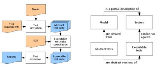
Model-based testing (MBT) is an application for designing and optionally executing artifacts to perform software testing or system testing. Models can be used to represent the desired behavior of a System Under Test (SUT), or to represent testing strategies and a test environment.

mbt

Fig 1: MBT workflow example. Source: Wikipedia

In the context of mobile, if we think about an end-user workflow with an application it will usually start with a Login to the app, performing an action, going back, performing a secondary action and often even a 3rd action based on the previous output of the 2nd. Complex Ha

The importance of modeling a mobile application serves few business goals:

  1. App release velocity
  2. App testing coverage (use cases)
  3. App test automation coverage (%)
  4. Overall app quality
  5. Cross-team synchronization (Dev, Test, Business)


As already covered in an old blog  I wrote, mobile apps would behave differently, and support different functionality based on the platform they are running (E.g., not every iOS device support both Touch ID and/or 3D Touch gesture). Therefore, being able to not only model the app and generate the right test cases but also to match these tests across the different platforms can be a key to achieving many of the 1-5 goals above.

In the market, today there are various commercial tools that can assist in MBT like CA Agile Requirement Designer, Tricentis Tosca, and others.

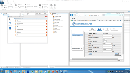
Looking at an example provided by one of the commercial vendors in the market (Tricentis), it can show a common workflow around MBT. A team aims to test an application; therefore, they would scan it using the MBT tool to “learn” its use cases, capabilities, and other artifacts so they can stack these into a common repository that can serve the team to build test automation.

tosca

Fig 2: Tricentis Tosca MBTA tool

In Fig 2., Tricentis examines a web page to learn its entire options, objects, and other data related items. Once the app is scanned, it can be easily converted into a flow diagram that can serve as the basis for test automation scenarios.

With the above goals in mind, it is important to understand that having an MBT tool that serves the automation team is a good thing, but only if it increases the team efficiency, its release velocity, and the overall test automation coverage. If the output of such tool would be a long list of test cases that either does not cover the most important user flows, or it includes many duplicates than this wouldn’t serve the purpose of MBT but rather will delay existing processes, and add unnecessary work to teams that are already under pressure.

In addition to the above commercial tools, there is an older but free tool that allows Android MBT with robotium called MobiGuitar. This tool not just offers MBT capabilities but also code coverage driven by the generated test scripts.

A best practice in that regards would be to probably use an MBT tool that can generate all the application related artifacts that include the app object repository, the full set of use cases, and allow all of that to be exported to leading open-source test automation frameworks like Selenium, Appium, and others.

Mobile Specific MBT – Best Practices and Examples

Drilling down into a workflow that CA would recommend around MBT would look as follows – In reality, the below is easier said than done for a Mobile App compared to Web and Desktop:

  1. The business analysts will create the story using tools like CA Agile Requirement Designer or such (see below more examples)
  2. The story is then passed to an ALM tool (e.g.: CA Agile Central [formerly Rally], Jira, etc.) for project tracking
  3. Teams use the MBT tools to collaborate
    1. The automation engineer adds the automation code snippets to the nodes where needed or adds additional nodes for automation.
    2. The programmer updates the model for technical specs or more technical details.
    3. The Test Data engineer assigns test data to the model
  4. Changes to the story are synchronized with the ALM Tool
  5. Test cases are synchronized with the ALM Tool
  6. The programmer completes coding
  7. The code is promoted from Dev to QA
  8. Testing begins
    1. The tester uses the test cases with test data from MBT tools for manual test case execution
    2. The automation scripts with test data are executed for functional and regression testing

To learn more about efficient MBT solutions, practices please refer to these sources:

Responsive Web: The Importance of Getting Test Coverage Right

When building your test lab as part of a RWD site test plan, it is important to strategically define the right mobile devices and desktop browsers which will be your target for your manual and automated testing.

For mobile device testing you can leverage your own analytics together with market data to complement your coverage and be future ready, or leverage reports such the Digital Test Coverage Index Report.

For web testing you should also look into your web traffic analytics or based on your target markets understand which are the top desktop browsers and OS versions on which you should test against – alternatively, you can also use the digital test coverage index report referenced above.

Related Post: Set Your Digital Test Lab with Mobile and Web Calendars

Coverage is a cross organizational priority where both business, IT, Dev and QA ought to be consistently aligned. You can see a recommended web lab configuration for Q1 2016 below which is taken from the above mentioned Index – Note the inclusion of Beta browser versions in the recommended mix due to the nature silent updates of these versions deployment on end-user browsers.

WCReport
For ongoing RWD projects  – once defining the mobile and web test coverage using the above guidelines, the next steps are of course to try and achieve parallel side by side testing for high efficiency, as well as keep the lab up to date by revising the coverage once a quarter and assure that both the analytics as well as the market trends still matches your existing configuration.

As a best practice and recommendation, please review the below mobile device coverage model which is built out of the 3 layers of Essential, Enhanced and Extended where each of these layers includes a mix of device types such as legacy, new, market leaders and reference devices (like Nexus devices).

MobileCoverageLayers

To learn more, check out our new Responsive Web Testing Guide.

responsive web testing strategy

Responsive Web: Test for the Real User Experience

One of the great benefits of building a responsive web site (RWD) is it can give the user a consistent web experience across any digital device, in any location.

Related Post: Responsive Web and Adaptive Web: Pros and Cons

When it comes to RWD testing, it’s important to test the navigation and functionality on desktop web browsers and mobile devices, but that alone is not enough to guarantee a consistent user experience at all times. The end user is constantly moving between environments throughout the day, and these environments have various attributes, including:

  1. Network conditions (Poor, good, no network)
  2. Locations
  3. App context based on platform and location
  4. Background activities (apps running and consuming resources)
  5. Ads and other popups that block your site content (see image below)

IMG_8543

With so many real user environments to consider for both mobile and the desktop web, testing teams should include user conditions in their RWD test plan on top of the traditional testing for UI, navigation, functionality and client-side performance. It will give your DevTest team peace of mind and reduce quality risks significantly.

To learn more, check out our new Responsive Web Testing Guide.

responsive web testing strategy

Responsive Web: Five Testing Considerations

With more and more consumers expecting to shop, bank, work and socialize across different devices, organizations are embracing responsive web design (RWD) as a tool to help them deliver a consistent digital experience on every screen.

multiplatform-1024x636

Growth of cross-device transactions (Source: Criteo’s State of Mobile Commerce Report)

But due to the complexity of digital environments and user experiences — responsive web is easier said than done. Organizations that develop RWD sites often face challenges when testing to assure smooth website navigation and a great user experience across multiple devices and platforms.

For more information, read our new Comprehensive Guide to Building a Responsive Web Testing Strategy

To get there, we recommended including the following five building blocks as part of your RWD test plan.
RWDTests-1024x368

Testing for these five areas will help achieve sufficient test coverage, a great user experience and higher traffic to your site.

To download the complete guide for testing RWD Site, go here

responsive-web-testing-strategy-2-600x315