A Frontend Web Developer’s Guide To Testing – Book Summary

In April 2022, I have published my 4th book which is 100% focused on how frontend web application developer’s can leverage the wide plethora of test automation frameworks that continuously evolve and provide more and more capabilities.

The book is available on Packt website (my publisher) as well as on Amazon and other book stores globally. I got great feedback so far from the community both on the importance of this book to practitioners, as well as the specific content. The book was reviewed by Bruno Bosshard with the foreword written by Gleb Bahmutov who’s one of the core leaders of Cypress in the marketplace.

Book Structure

The book consists of 3 main sections:

Section 1: Fundamentals of Web App Testing

This sections has the following main chapters and it offers structured approach to building a solid testing strategy across all methodologies – Exploratory, Functional, Performance, API, Accessibility, and more.

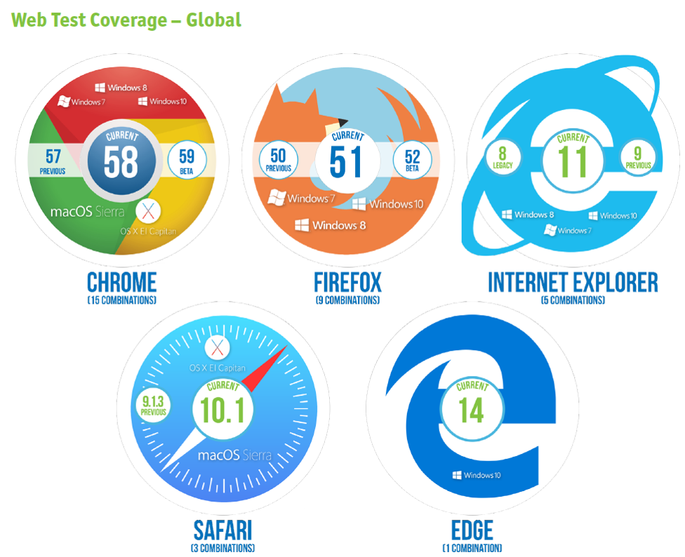
  1. Cross-Browser Testing Methodologies
  2. Challenges Faced by Frontend Web Application Developers
  3. Top Web Test Automation Frameworks
  4. Matching Personas and Use Cases to Testing Frameworks
  5. Introducing the Leading Frontend Web Development Frameworks

Section 2: Continuous Testing Strategy for Web App Developer’s

This section provides an overview of the criteria that frontend web application developers should look for when choosing a test automation framework, and specifically look into test coverage strategy for web apps.

  1. Map the Pillars of a Dev Testing Strategy for Web Applications
  2. Core Capabilities of the Leading JavaScript Test Automation Frameworks
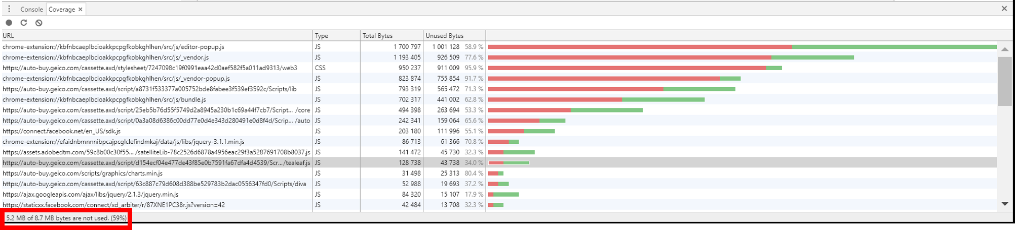
  3. Measuring Test Coverage of the Web Application

Section 3: Frontend JavaScript Web Test Automation Framework Guides

The final section of the book dives deeper into the features and differences across the 4 leading web application testing frameworks, and concludes the section with an overview of some low-code testing tools that are derived from some of these testing frameworks.

  1. Working with the Selenium Framework
  2. Working with the Cypress Framework
  3. Working with the Playwright Framework
  4. Working with the Puppeteer Framework
  5. Complementing Code-Based Testing with Low-Code Test Automation

Overview of What’s Changing within Web Application Testing?

While writing the book i already became aware of few main trends that in my opinion will shape the future of the testing practice over the next few years.

  • Leveraging CDP to enhance test automation coverage, auditing of performance, network traffic and accessibility.
    • Selenium 4 added support for this rich protocol
    • Playwright and Puppeteer are build on top of CDP
    • Cypress integrates with CDP to benefit from its core features
  • Introduction of the modern concept of Component Testing!
    • Cypress version 10 officially supports Component Testing that allows isolation of a web application component for more rigor and focused testing.
    • Latest Playwright release also starts referring to component testing
Cypress Component Testing of React App (source: Cypress Blog)
  • Built-in low-code abilities within code-based testing frameworks
    1. Selenium 4 introduces a revamped version of the Selenium IDE
    2. Playwright offers its Code-Gen test recorder
    3. Cypress integrates with the Chrome browser recorder
  • Community contributions and Plugins!
    • Open source software can only grow through its communities and the level of engagement and support that such tools receive. With all of the above frameworks we see tremendous communities that provide real-time support through slack, gitter, Discord, GIT code sample, and a lot of customized plugins. With these plugins, test frameworks like Cypress, selenium, playwright and puppeteer enhances their features to cover visual testing, integrate with CI servers, accessibility testing, code coverage, API testing, CDP integration, and much more.

Bottom line

I do hope that this book will provide value to any frontend web application developers and test automation engineers, and serve them for the coming years. The digital transformation continues to evolve with modern web apps like progressive web apps (PWAs), responsive web (RWD), Flutter, and others. With such mature testing tools, practitioners are in a great place today to cover many of the sophisticated use cases, and eliminate bugs earlier in their software iterations.

Happy Testing!

The Rise of Progressive Web Apps and The Impact on Cross-Browser Testing

If we all thought we’ve figured out the digital market from an application type perspective, and have seen the rise of mobile, and the transformation of web to responsive web – now we should all start getting used to a whole new type of application that should change the entire user experience and offer new web functionality – Meet PWA’s.

Google.com is a very clear example of such app, and Apple is about to introduce PWA capabilities in its upcoming WebKit engine.

What are Progressive Web Apps?

If to refer to Google official website dedicated to PWA, Google defines PWA as “A new way to deliver amazing user experiences on the web

David Rubinstein from SD Time, actually add even more insights into these new app types:

PWAs can use device features like cameras, data storage, GPS and motion sensors, face detection, Push notifications, and more. This will pave the way for AR and VR experiences, right on the web. Imagine being able to redecorate your home virtually using nothing but your phone and a PWA. Pan your camera around a room, then use tools on a website to change wall colors, try out furniture, hang new artwork, and more. It may feel like a futuristic fantasy, but it’s close to reality.

The key behind PWA apps is to provide a rich end-user alternative to native apps. These apps can be launched from the device home screen adding layers of performance, reliability, and functionality to a web application without the need to install anything from the app store. In addition, these apps that are still JavaScript based, but with additional specific API’s can work even when there’s no internet connection and that’s  a huge advantage.

PWA apps leverage 2 main architectural features:

  • Service Workers – give developers the ability to manually manage the caching of assets and control the experience when there is no network connectivity.
  • Web App Manifest – That’s the file within the PWA that describe the app, provide metadata specific to the app like icons, splash screens and more. See below an example Google offers for such a descriptor file (Json)
{
  "short_name": "AirHorner",
  "name": "Kinlan's AirHorner of Infamy",
  "icons": [
    {
      "src": "launcher-icon-1x.png",
      "type": "image/png",
      "sizes": "48x48"
    },
    {
      "src": "launcher-icon-2x.png",
      "type": "image/png",
      "sizes": "96x96"
    },
    {
      "src": "launcher-icon-4x.png",
      "type": "image/png",
      "sizes": "192x192"
    }
  ],
  "start_url": "index.html?launcher=true"
}


In order to check the correctness of your PWA checklist and the entire app, Google offers some tools as part of their documentation like this Progressive Web Apps checklist, and their chrome built-in DevTools (see below visual),

As deeply covered in this great Dzone article, good PWAs also implement the PRPL pattern recommended by Google to enhance performance.

What Are the Implications of PWAs for Cross-Browser sites and Mobile Apps?

To understand the implications, I recommend dividing the question into the impacted Personas.

  1. Developers
  2. Testers
  3. Business
  4. End-Users

Each of the above Personas will have different benefits and implications when adopting this kind of apps.

Developers

For existing web developers, this new app type should present a whole new world of innovative opportunities. Since PWAs are still JavaScript based apps, developers do not need to gain new skills, but rather learn the new APIs offered through the Service Workers and see how they can be leveraged by their websites.  Since the PWA app runs on a mobile device and can be launched without a network connection and without any installation, obviously it needs to be validated by developers through unit and integration tests.

Going forward, the market envisions these apps impacting the native apps architecture in a way that there will only be 1 type of app that can seamlessly run on both browsers and mobile devices with one single implementation – that will require a heavier lift and re-work.


Testers

For testers, as in every new implementation, new tests (manual, automated) needs to be developed, executed and fit into the overall pipeline.

PWAs, in particular, introduces some unique use cases such as

  • No network operation
  • High performance 
  • Sensors based functionality (Location, Camera for AR/VR and more)
  • Cross-device functionality (like in Responsive, the experience should be the same regardless of the screen size/HW etc.)
  • Adhering to the design and checklist required by Google and soon Apple
  • Accessibility is always a need
  • Security of these apps (with and without being connected to the network)

Business

For the business, the new app types shall help increase the end-user engagement with the business. When having a web application that is richer in functionality, performs fast, and can be “always on” through an easy launch from the customers’ device home screen, this by definition should increase usage and move the needle to the business. My assumption is that large enterprises are already looking into these type of apps as the next-gen RWD apps.

End Users

At the end of the day, all products are aiming to get greater engagements with the customers and beat the competition. Obviously, if the end users will understand the value in these apps, and can “feel” it in their day by day activities, this will be a clear Win-Win situation to both the organization as well as the customer.

To assure end-user experience as Google envisioned when first launching this technology 3 years ago (2015), Dev and Test teams should continue their continuous testing activities, and make sure they are covering sufficient platform, features and use cases between each release and each new release of a platform or device.

To conclude this blog, I highly recommend watching the short video and read the blog from Mozilla on how PWA live within Firefox and how different experience users get from such apps (see below Firefox Wego app within Firefox browser in the background and a PWA Wego app in the foreground)

Happy PWA Testing!

Mobile, Cross Browser Testing, DevOps and Continuous Testing Trends and Projections for 2018

As we about to wrap out 2017, It’s the right time to get ready to what’s expected next year in the mobile, cross-browser testing and DevOps landscape.

To categorize this post, I will divide the trends into the following buckets (there may be few more points, but I believe the below are the most significant ones)

  • DevOps and Test Automation on Steroids Will Become Key for Digital Winners
  • Artificial Intelligence (AI) and Machine Learning (ML)/ Tools alignment as part of Smarter Testing throughout the pipeline
  • IOT and Digital Transformation Moving to Prime Time


DevOps and Automation on Steroids

If in 2017, we’ve seen the tremendous adoption of more agile methods, ATDD, BDD and organizations leaving legacy tools behind in favor of faster and more reliable and agile-ready testing tools, such that can fit the entire continuous testing efforts whether they’re done by Dev, BA, Test or Ops.

In 2018, we will see the above growing to a higher scale, where more manual and legacy tools skills are transforming into more modern ones. The growth in continuous testing (CT), Continuous Integration (CI) and DevOps will also translate into much shorter release cadence as a bridge towards real Continuous Delivery (CD)


Related to the above, to be ready for the DevOps and CT trend, engineers need to become more deeply familiar with tools like Espresso, XCUITest, Earl Grey and Appium on the mobile front, and with the open-source web-based framework like the headless google project called Puppeteer, Protractor, and other web driver based framework.

In addition, optimizing the test automation suite to include more API and Non-Functional testing as the UX aspect becomes more and more important.

Shifting as many tests left and right is not a new trend, requirement or buzz – nothing change in my mind around the importance of this practice – the more you can automate and cover earlier, the easier it will be for the entire team to overcome issues, regressions and unexpected events that occur in the project life cycle.

AI, ML, and Smarter Test Automation

While many vendors are seeking for tools that can optimize their test automation suite, and shorten their overall execution time on the “right” platforms, the 2 terms of AI and ML (or Deep learning) are still unclear to many tool vendors, and are being used in varying perspectives that not always mean AI or ML 🙂

The end goal of such solutions is very clear, and the problem it aims to solve is real –> long testing cycles on plenty of mobile devices, desktop browsers, IOT devices and more, generates a lot of data to analyze and as a result, it slows down the DevOps engine. Efficient mechanism and tools that can crawl through the entire test code, understand which tests are the most valuable ones, and which platforms are the most critical to test on due to either customer usage or history of issues etc. can clearly address such pain.

Another angle or goal of such tools is to continuously provide a more reliable and faster test code generation. Coding takes time, requires skills, and varies across platforms. Having a “working” ML/AI tool that can scan through the app under test and generate robust page object model, and functional test code that runs on all platforms, as well as “responds” to changes in the UI, can really speed up TTM for many organization and focus the teams on the important SDLC activities in opposed to forcing Dev and Test to spend precious time on test code maintenance.

IOT and The Digital Transformation

In 2017, Google, Apple, Amazon and other technology giants announced few innovations around digital engagements. To name a few, better digital payments, better digital TV, AR and VR development API and new secure authentication through Face ID. IOT this year, hasn’t shown a huge leap forward, however, what I did notice, was that for specific verticals like Healthcare, and Retail, IOT started serving a key role in their digital user engagements and digital strategy.

In 2018, I believe that the market will see an even more advanced wave in the overall digital landscape where Android and Apple TV, IOT devices, Smart Watches and other digital interfaces becoming more standard in the industry, requiring enterprises to re-think and re-build their entire test lab to fit these new devices.

Such trend will also force the test engineers to adapt to the new platforms and re-architect their test frameworks to support more of these screens either in 1 script of several.

Some insights on testing IOT specifically in the healthcare vertical were recently presented by my colleague Amir Rozenberg – recommend to review the slides below

https://www.slideshare.net/AmirRozenberg/starwest-2017-iot-testing/ 


Bottom Line

Do not immediately change whatever you do today, but validate whether what you have right now is future ready and can sustain what’s coming in the near future as mentioned above.

If DevOps is already in practice in your organization, fine – make sure you can scale DevOps, shorten release time, increase test and platform automation coverage, and optimize through smarter techniques your overall pipeline.

AI and ML buzz are really happening, however, the market needs to properly define what it means to introduce these into the SDLC, and what would success look like if they do consider leveraging such. From a landscape perspective, these tools are not yet mature and ready for prime time, so that leaves more time to properly get ready for them.

Happy New 2018 to My Followers.

Trends in Cross Browser Testing and Web Development

Typically, i”ll write a lot on mobile app testing, tools, trends, coverage and such.

In this blog, I actually wanted to share some up to date trends as I see them in the web landscape.

The web market has shifted a lot over the past years alongside the mobile space. We see a clear use of specific development languages, development frameworks and of course specific test frameworks aimed to test Angular, jQuery, Bootstrap,.Net and other websites.

From a Dev Language perspective, the web FE developer is mostly using the following languages as part of his job:

Sourcehttp://vintaytime.com/premium/top-programming-languages/

As a clear trend in web development, it shows that JavaScript is the leading language used by web developers. It’s actually not a huge surprise since if you move to the top frameworks used by these web developers, you will see quite a few that are based on JavaScript.

There are some trends seen recently by developers around shifting to non AngularJS web development framework like Aurelia, React, and Vue.JS that are seeing a growing usage and adoption by developers due to considerations such as (larger list of Pro’s/Con’s are in source 1 below). With this trend in mind, and you’ll read in my references below, the new solutions are still not as complete as AngularJS is.

  • Shorter learning curve
  • Simple to use, clean
  • Flexibility
  • Lightweight compared to others (less than half the size of AngularJS e.g.)
  • Better performing
  • Easy to integrate with other front-end stack tools
  • Responsive server-side rendering (Vue.JS supports it, reduces time for users to see rendered content)
  • SEO Friendly
  • Good documentation and Community Support
  • Good debugging capabilities

Source 1: https://www.slant.co/topics/4306/~angular-js-alternatives

Source 2: https://w3techs.com/technologies/details/js-angularjs/all/all

Now, that we have seen the leading web development languages, and frameworks used these days, let’s drill down into what test automation engineers are adopting.

Selenium without a doubt is the leading and base for most frameworks, however, even in this space, we see new and innovative test frameworks such as Casper.JSTestCafeBuster.JSNightwatch.JS together with the traditional Webdriver.IO and of course Protractor.

If we examine the below visual (SourceNPM Trends), it’s a clear market dominance between Selenium and Protractor that underneath its implementation does uses Selenium WebDriver, and supports Jasmine and Mocha tools.

The advantage of tools like Protractor is that they support much easier web sites that were developed in various frameworks like AngularJS, Vue.JS etc. Such advantage allows test automation engineers to agnostically use them for multiple websites regardless to the frameworks they are built with.

It is not that easy, and pink as I described above, but it does give a good headstart when starting to build the test automation Foundation.

Thre are few other players in that space that are aimed at specific unit testing, and headless browser testing (Phantom.JS, Casper.JS, JSDom etc.).

As I blogged in the past, from a test automation strategy perspective, teams might find it beneficial and more complete to leverage a set of test frameworks rather than using only one. If the aim is to have non-UI headless browser testing together with Unit testing and also UI based testing, then a combination of tools like Protractor, Casper.JS, QUnit might be a valid approach.

I hope you find this post useful, and can “swim” in the hectic tools landscape. As always, it is important to match the tool to the product requirements, development methodology (BDD, Agile, Waterfall etc.), supported languages and more.

Recent Web Browser Quality Related Innovations

Yea, I know that my blog title is mobiletestingblog, but that’s not a mistake in the title 🙂

There is no distinction anymore around which platform is used to consume content today, whether it’s a smartphone, tablet or a desktop browser when it comes to web apps.

If your company is developing a web app or responsive website, these sites ought to be tested thoroughly against all of the above platforms. The majority of web traffic BTW today is coming from mobile devices.

In general, it is good to know that from a desktop browser market share, there are less familiar players such as UC browser by Alli-baba and Samsung Internet browsers that hold a nice chunk of the market (globally) – so, avoiding them as  part of your test coverage matrix might not be a good strategy.

Sourcehttp://gs.statcounter.com/browser-market-share

In general, the below would be the formula for web testing that I would recommend these days, however if from a web traffic analysis and supported geographies you have a requirement to target China, Europe, and others – then the above metrics should be added to the mix either in addition to the below, or as an adjustment.

With that in mind, I wanted to highlight in this post some recent web specific tools that are out there, free and can be extremely useful for both developers and testers.

In Google Chrome 59 (Beta is already available today!), Google is introducing new code coverage built-in tools that can allow both developers and testers to record the screen activities and report back in a nice dashboard how much of the site content (javascript, and more) was actually executed in an aim to optimize the website quality, performance and much more.

From a user perspective, they only need to enable the Code Coverage option from within the developer tools in Chrome, so it is added under the Sources menu option as seen in the below

Once that is done, simply start capturing the code coverage by clicking on the Record button to get an output like the below – simple, valuable, and unfortunately only available as free and built-in solution within this browser compared to FireFox/Safari and others 😦

I went and used this new tool on Geico.com responsive site and nearly completed the most common transaction of querying for a new car insurance. At the end of the recording, i received the below chart that as you’ll see – shows a usage of only ~60% of the site JavaScript code in this journey.

When drilling down deeper to a specific .JS source file, you can see a highlighted source with Green/Red where it is actually used and unused – this is what your web developers need to see and optimize wisely.

Let’s see a key feature that was recently introduced in FireFox also, and cab be useful for both Dev and testers.

2 weeks ago, Mozilla released FireFox 53 that is their 1st step in a new project called Quantum, that aims to enhance performance, stability and more.

Among the innovations in that release are compact themes, usability features like reading time for the page, new permission model (see below), faster performance and few other bug fixes for stability.


Detailed release notes on FF 53 can be found here: https://www.mozilla.org/en-US/firefox/53.0/releasenotes/.

In addition to the newly introduced features, and if you’re not aware of – FireFox offer quite useful developer tools including object inspector, performance monitor, debugger and network monitor that can also enhance your overall web Dev and Test activities (see example below)

Performance Monitoring Tools From Within FireFox Developer Tools

Network Monitoring Options From Within FireFox Developer Tools

Bottom Line

With Chrome and FireFox being the leading Desktop and Mobile browsers, it is very important for web teams to continuously monitor the early releases from Google and Mozilla, and as the 1st Beta or Dev branches are available to validate – Do It. This can not only reveal earlier regressions but might also as mentioned in this blog, offer you some new productivity tools that can increase the value to your overall Dev and Test activities.

Google Mobile Friendly With Perfecto and Quantum

Guest Blog Post by Amir Rozenberg, Senior Director of Product Management, Perfecto

resize

Google recently announced “Mobile First Indexing”, from Google:

To make our results more useful, we’ve begun experiments to make our index mobile-first. Although our search index will continue to be a single index of websites and apps, our algorithms will eventually primarily use the mobile version of a site’s content to rank pages from that site, to understand structured data, and to show snippets from those pages in our results (Source).

screen-shot-2017-02-13-at-5-33-26-pm

More recently they made the Google Mobile-Friendly tool and guidelines available. A very nice interactive version is available here, and images at the bottom of the thread, while there’s also an API (which, thanks to Google, can allow users to exercise first before they code). Google also offers code snippets in several languages.

Notes:

  • Google takes a URL and renders it. If you run multiple executions in parallel there’s no point in sending the same URL from every execution because the result would be the same
  • Google returns basically “MOBILE_FRIENDLY” or not. Suggest to set the assert on that
  • The current API differs from the UI such that it only provides the results for Mobile friendly (and the UI gives also mobile and web page speed). Hopefully, Google adds that to the response 😉
  • This will probably not work for internal pages as Google probably doesn’t have a site-to-site secure connection with your network.


For developers and testers who do not have time, testing mobile friendliness repeatedly probably will simply not happen. That’s why I integrated Google Mobile-Friendly API into Quantum:

  • Added 2 Gherkin commands
// If you navigate directly to this page
Then I check mobileFriendly URL "http://www.nfl.com"
// If you got to this page through clicks
Then I check mobileFriendly current URL
  • Added the Gherkin command support (GoogleMobileFriendlyStepsDefs.java)
  • And the script example is pretty simple:
@Web
Feature: NFL validate

  @SimpleValidation
  Scenario: Validate NFL
    Given I open browser to webpage "http://www.nfl.com"
    Then I check mobileFriendly current URL
    Then I check mobileFriendly URL "http://www.nfl.com"
    Then I wait "5" seconds to see the text "video"


That’s it. Next steps:


Ideas for future improvement:

  • You can automate the validation such that every click would trigger a check with Google behind the scenes.

Just for fun, some more screenshots for detailed analysis for NFL.com:


screen-shot-2017-02-13-at-5-33-48-pm


screen-shot-2017-02-13-at-5-34-09-pm

screen-shot-2017-02-13-at-5-34-23-pm


Criteria’s for Choosing The Right Open-Source Test Automation Tools

I presented last night at a local Boston meetup hosted by BlazeMeter a session together with my colleague Amir Rozenberg.

The subject was the shift from legacy to open-source frameworks, the motivations behind and also the challenges of adopting open-source without a clear strategy especially in the digital space that includes 3 layers:

  1. Open source connectivity to a Lab
  2. Open-source and its test coverage capabilities (e.g. Can open-source framework support system level, visual analysis, real environment settings and more)
  3. open-source reporting and analysis capabilities.

During the session, Amir also presented an open-source BDD/Cucumber based test framework called Quantum (http://projectquantom.io)

Full presentation slides can be found here:

Happy Reading

Eran & Amir

Responsive Web: The Importance of Getting Test Coverage Right

When building your test lab as part of a RWD site test plan, it is important to strategically define the right mobile devices and desktop browsers which will be your target for your manual and automated testing.

For mobile device testing you can leverage your own analytics together with market data to complement your coverage and be future ready, or leverage reports such the Digital Test Coverage Index Report.

For web testing you should also look into your web traffic analytics or based on your target markets understand which are the top desktop browsers and OS versions on which you should test against – alternatively, you can also use the digital test coverage index report referenced above.

Related Post: Set Your Digital Test Lab with Mobile and Web Calendars

Coverage is a cross organizational priority where both business, IT, Dev and QA ought to be consistently aligned. You can see a recommended web lab configuration for Q1 2016 below which is taken from the above mentioned Index – Note the inclusion of Beta browser versions in the recommended mix due to the nature silent updates of these versions deployment on end-user browsers.

WCReport
For ongoing RWD projects  – once defining the mobile and web test coverage using the above guidelines, the next steps are of course to try and achieve parallel side by side testing for high efficiency, as well as keep the lab up to date by revising the coverage once a quarter and assure that both the analytics as well as the market trends still matches your existing configuration.

As a best practice and recommendation, please review the below mobile device coverage model which is built out of the 3 layers of Essential, Enhanced and Extended where each of these layers includes a mix of device types such as legacy, new, market leaders and reference devices (like Nexus devices).

MobileCoverageLayers

To learn more, check out our new Responsive Web Testing Guide.

responsive web testing strategy

Responsive Web: Test for the Real User Experience

One of the great benefits of building a responsive web site (RWD) is it can give the user a consistent web experience across any digital device, in any location.

Related Post: Responsive Web and Adaptive Web: Pros and Cons

When it comes to RWD testing, it’s important to test the navigation and functionality on desktop web browsers and mobile devices, but that alone is not enough to guarantee a consistent user experience at all times. The end user is constantly moving between environments throughout the day, and these environments have various attributes, including:

  1. Network conditions (Poor, good, no network)
  2. Locations
  3. App context based on platform and location
  4. Background activities (apps running and consuming resources)
  5. Ads and other popups that block your site content (see image below)

IMG_8543

With so many real user environments to consider for both mobile and the desktop web, testing teams should include user conditions in their RWD test plan on top of the traditional testing for UI, navigation, functionality and client-side performance. It will give your DevTest team peace of mind and reduce quality risks significantly.

To learn more, check out our new Responsive Web Testing Guide.

responsive web testing strategy

Responsive Web: Five Testing Considerations

With more and more consumers expecting to shop, bank, work and socialize across different devices, organizations are embracing responsive web design (RWD) as a tool to help them deliver a consistent digital experience on every screen.

multiplatform-1024x636

Growth of cross-device transactions (Source: Criteo’s State of Mobile Commerce Report)

But due to the complexity of digital environments and user experiences — responsive web is easier said than done. Organizations that develop RWD sites often face challenges when testing to assure smooth website navigation and a great user experience across multiple devices and platforms.

For more information, read our new Comprehensive Guide to Building a Responsive Web Testing Strategy

To get there, we recommended including the following five building blocks as part of your RWD test plan.
RWDTests-1024x368

Testing for these five areas will help achieve sufficient test coverage, a great user experience and higher traffic to your site.

To download the complete guide for testing RWD Site, go here

responsive-web-testing-strategy-2-600x315